
The questions answered by this analysis:
- Has the behavior of the current customer base changed much over time?
- Should you be spending time and resources on retention campaigns over customer acquisition.
- Create metrics to understand drivers of CLV migration.
Customer lifetime value changes over time as you observe new data about a customer. It’s important to measure CLV migration at the individual customer level on a regular fixed interval. You can analyze migration using predicted total CLV (recommended) or a trailing twelve month average order value (TTM AOV) or some other relevant customer metric.
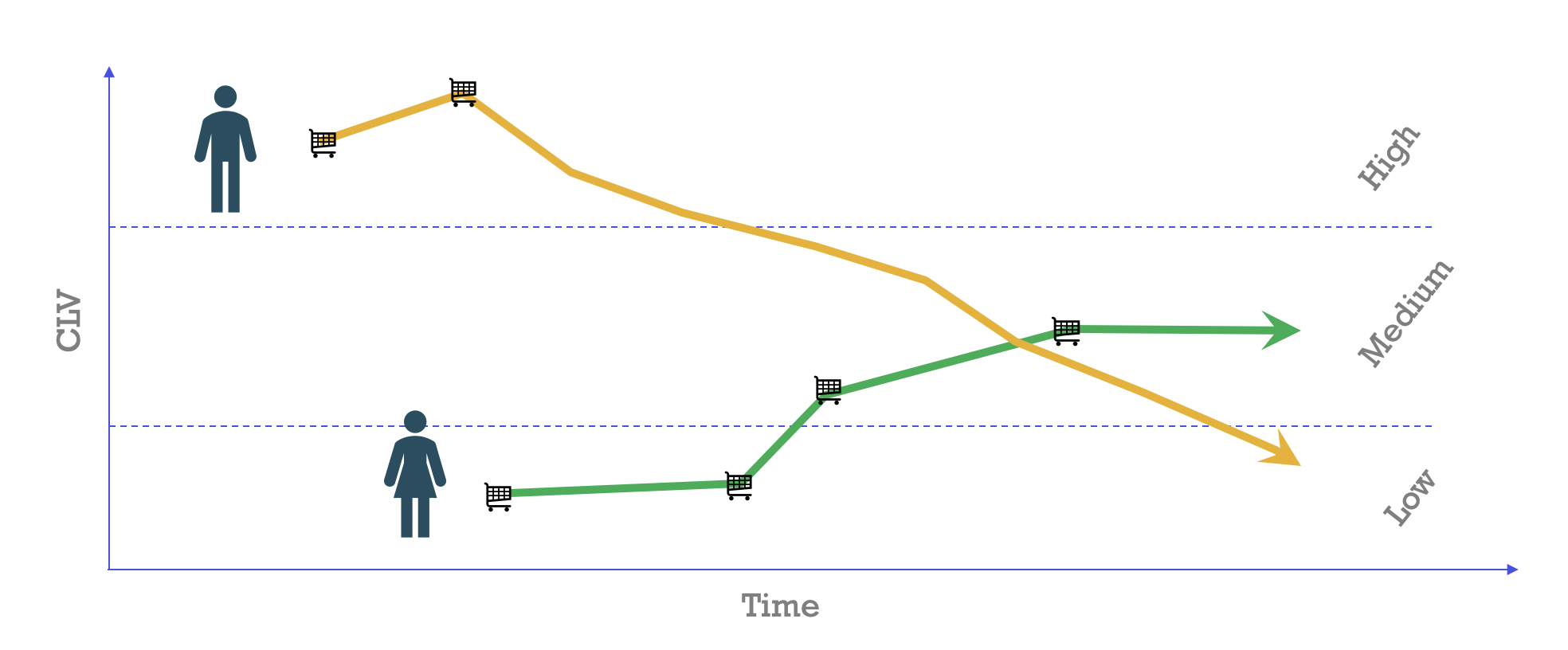
A useful example of this can be seen in the figure above, where we compare two customers who start out at different CLV levels. The first customer completed two transactions in a relatively short time period at a higher price point. Using an early CLV model, we determined that this is a high CLV customer in the first few months. But, as time went on, a lack of further purchases indicated that this customer no longer has high lifetime value.
What Is CLV Migration?
In the previous example, we compared the first customer with another who started off with low CLV. The second customer later engaged in a pattern of higher frequency buying over time, thus moving her into the medium tier of CLV. This concept is customer lifetime value migration, also known as intra-cohort CLV migration. (This concept differs from inter-cohort migration, which measures the quality of customer acquisition.)
You can also consider the intuition behind this concept from the customer’s point of view. As a customer gets exposed to new types of marketing campaigns, new competition, and products, his or her behavior will change.
Analyzing CLV Migration
In a CLV migration analysis, the very first step is to compute the specific metric (in this case, CLV) on an ongoing basis. You can calculate CLV retroactively by picking an “as-of-date.” Then, censor your data from that point onward as if you were computing the metric on that particular date. For instance, if we wanted to go back in time and compute the CLV of customers a year ago, we would just exclude all events after that date for the analysis.
Once you have computed CLV for each customer for multiple as-of-date values, you can group by customers and as-of-dates. Next, determine quantiles for each customer based on those groups. We typically recommend three to five customer quantiles.
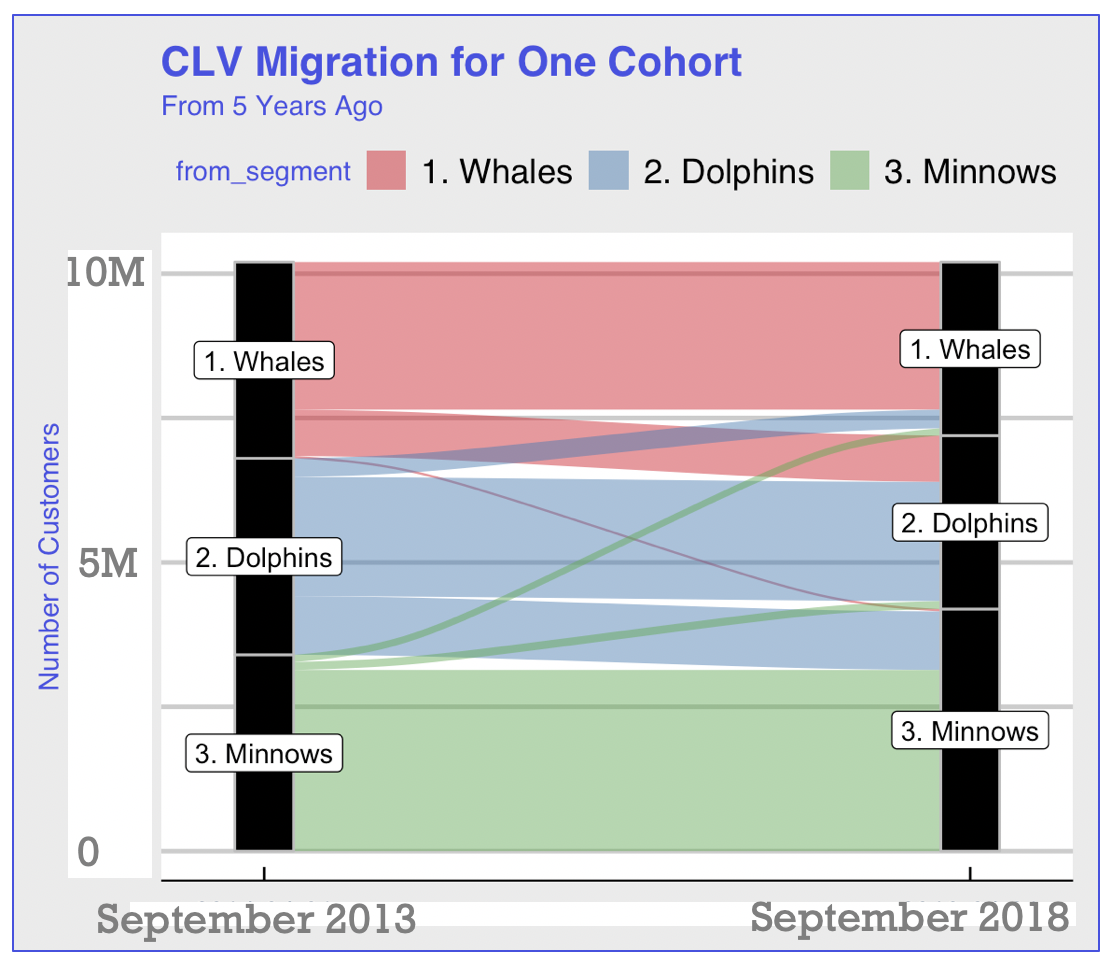
Whales, Dolphins, and Minnows
For the purposes of this discussion, we will distribute every single customer into three different tiers: below the 33rd percentile, between 33rd and 66th percentiles, and above the 66th percentile. Label each customer with one of the three tiers in any given period. For simplicity, let’s label the tiers as whales, dolphins, and minnows to indicate the highest to lowest tiers, respectively.
These tiers allow you to put customers into different buckets and monitor meaningful changes in their behavior over time. For example, it’s compelling to know what percentage of customers started off as whales, but became either dolphins or minnows by the end of their customer journey. You can also consider seasonal behavior and observe if customers switch tiers quarter-over-quarter or month-over-month.
Understanding Migration Using Your Own Data
Pick two dates and answer the following questions:
- Which tier do most new customers fall into?
- What percentage of customers went from a high tier to a medium or low tier?
- Similarly, what percentage of customers move from the medium tier to the other two tiers?
- Lastly, what percentage of customers go from the lowest tier to the medium and high tiers?
Visualizing CLV Migration
The following chart shows this type of migration. Generally, what we expect to see is that people stick with their existing tiers. From time to time, they migrate up or down. In a business that’s doing well, very few people migrate downward and more people migrate upward.
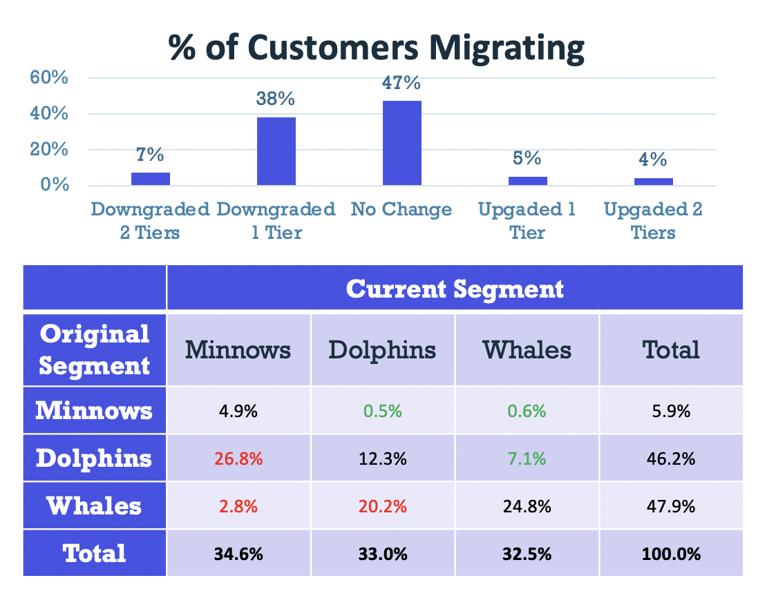
Other information you may want to know over this time might include the percentage of customers who:
- downgraded multiple tiers
- migrated once
- did not migrate
- migrated upwards once
- migrated upwards twice
To get this information, generate the table below.
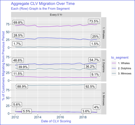
Build a Plot to Show How CLV is Changing Over Time
After completing this analysis for two specific dates, you can see if the trends are stationary over time. Use the same calculations and add something that shows this pattern over time. Consider the figure below: Despite the number of migrations that are happening, you can see that they tend to stay consistent over time.
Customer migration analysis can be very helpful in understanding how the value of a customer changes over time. As a business, you want to incentivize upward customer migrations, or, at the very least, hold them constant.