
We will start off with simple visualizations and customer level metrics that are easy to understand. Next, we will introduce more accounting-based methodologies to look at customer metrics. Lastly, we introduce the concept of forecasting and predictive analytics.
Customer Cohort Charts
The first set of visualizations showcase how customers, revenue, and lifetime revenue change over time.
Note: In the examples below, we only included partial data from 2020, which accounts for the drop of customer, revenue, etc. in 2020.
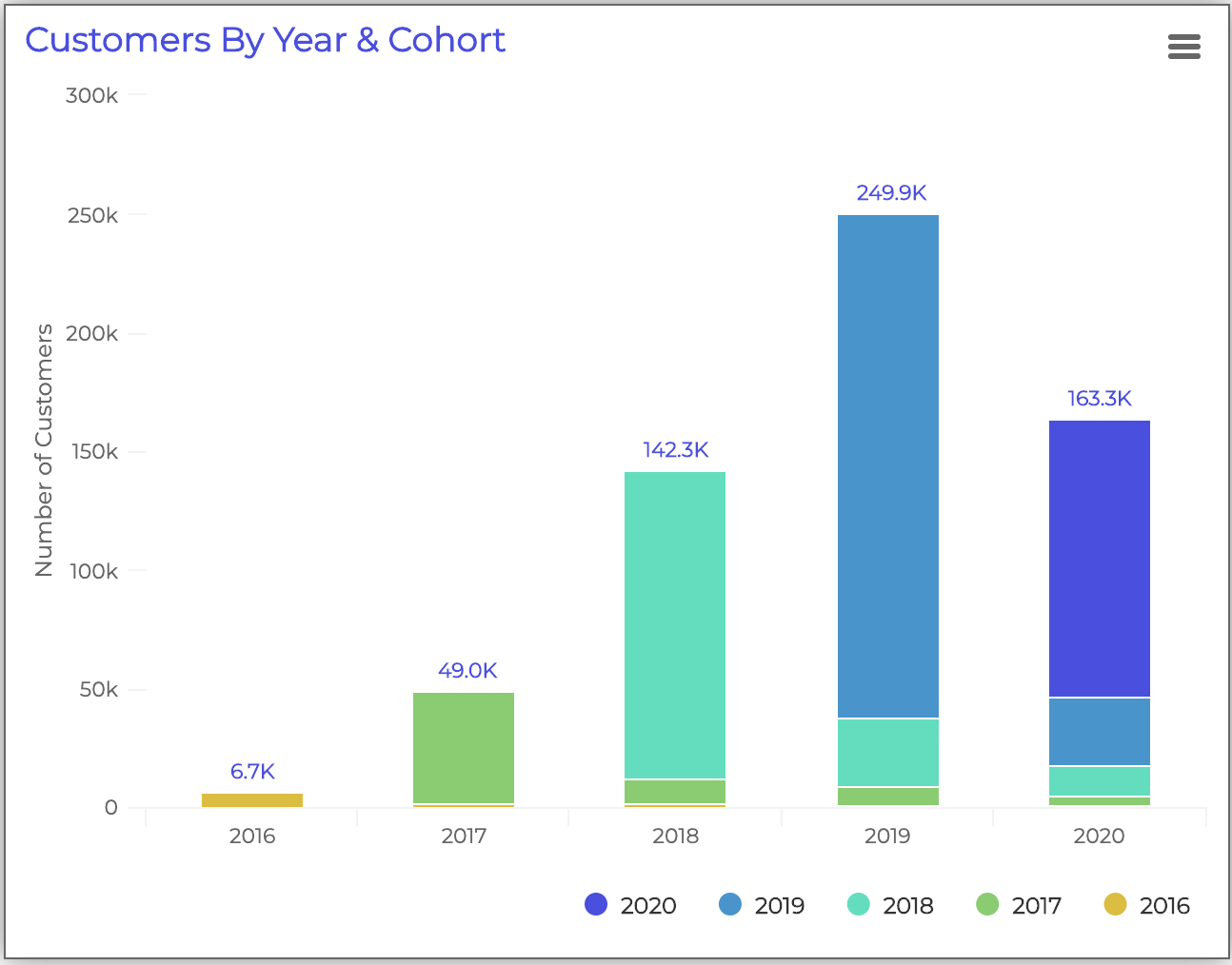
The first chart shows the number of total customers each year and compares the size of each cohort over time. You can use this chart to make sure you’re retaining a percentage of customers from the previous year.
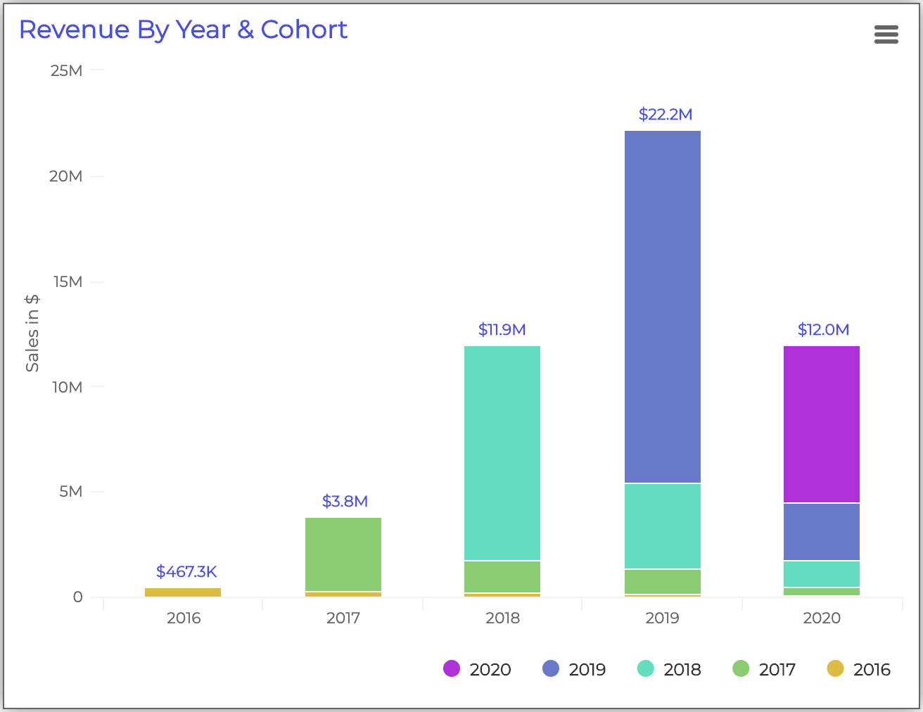
This chart shows the total sales each year, and each color represents the cohort of customers that contributed to that revenue. Like the previous chart, we want to see revenue retention in each cohort of customers. This chart provides another layer of illustration; it also shows if each cohort is spending more or less over time.
By looking at revenue instead of the number of customers, you can see if the company is keeping higher-value (higher spending) customers over time.
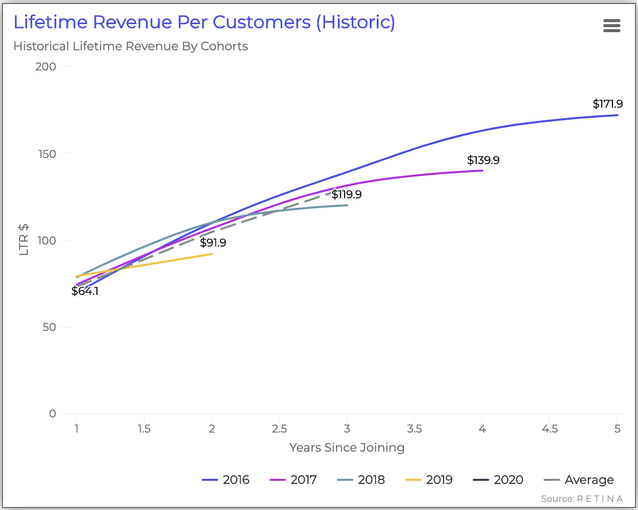
Finally, the chart above shows the historical Customer Lifetime Revenue for each cohort over time. The cohort LTR is re-assessed each year after the cohort has joined for up to 5 years.
By comparing the change in LTR each year, you can see in the example above that the company is acquiring customers that will spend more in the future, because LTR is increasing at year 0.
Customer Retention Charts
Next, we will look at retention visualizations that show how many customers continue to make purchases over time.
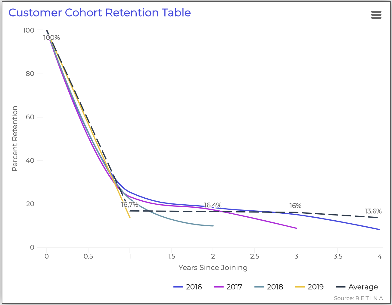
This chart shows how many customers in each cohort remain customers over time. Each curve represents a cohort. As the time from first purchase increases, the curve shifts depending on how many customers are making repeat purchases.
Different industries and business models can have various repeat purchase rates; subscription businesses tend to have higher rates. In this example, the visualization shows clear product market fit because a steady stream of customers tend to make repeat purchases (16% on average), which is good for a non-subscription business. Acquiring similar customers can help increase retention rates.
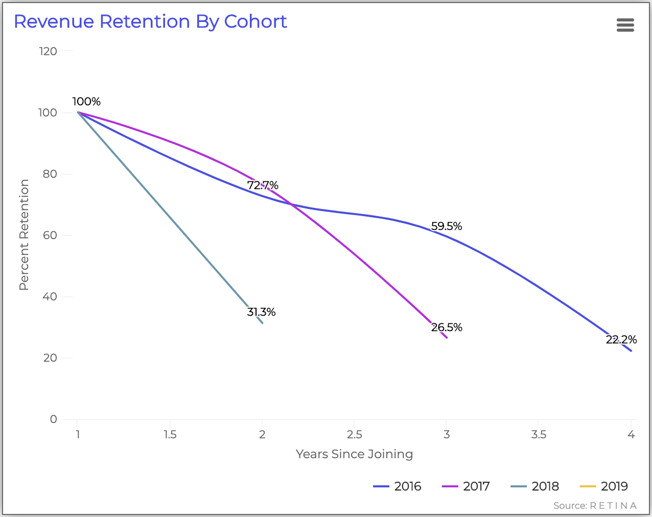
Next, the chart above represents revenue retention instead of customer retention. The chart measures the quality of retention. The x-axis represents the number of years since the customer’s first purchase, and the y-axis represents the percentage of revenue retention. Each cohort year is represented by a different colored line.
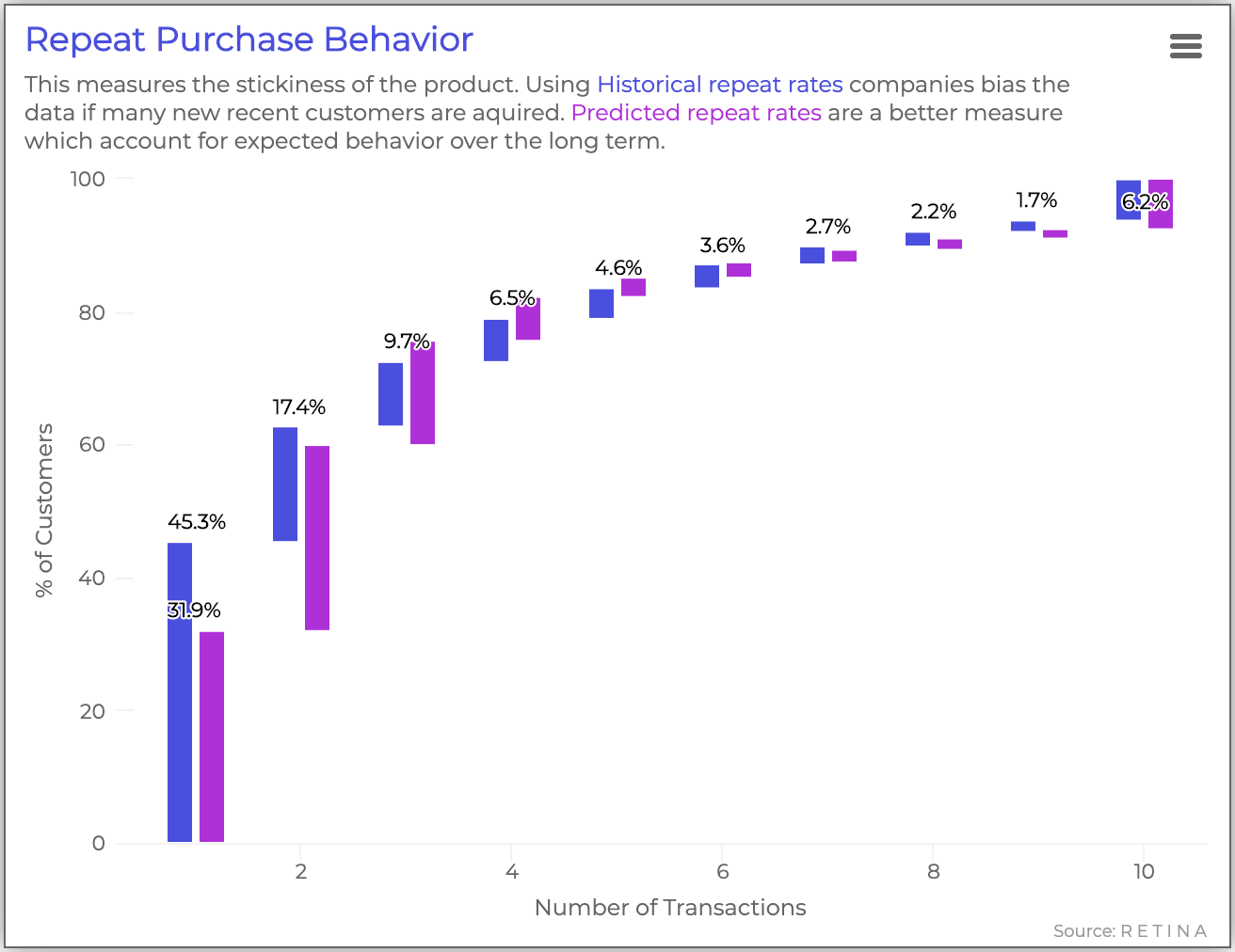
The final retention-focused chart illustrates a comparison between historical and predicted repeat purchase rates.
The first bars on this chart shows the percentage of one-and-done customers. Ideally, you want to see a higher percent of customers come back for repeat purchases. Beyond the first bar, the chart should show a long tail of customers who complete multiple transactions over time.
This example shows that about 55% of customers have made more than one transaction. By forecasting behavior to adjust for recency, we expect 68% of customers to make another purchase.
Customer Profitability
We can also use customer lifetime value metrics to illustrate customer profitability.
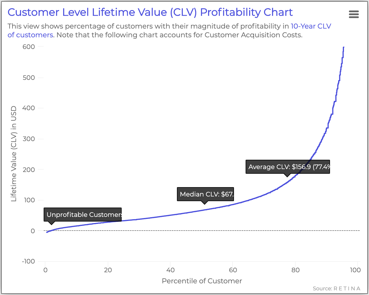
This chart shows the Customer Lifetime Value for the customer base graphed in ascending order. For this example, the low CAC (represented by the dotted line) means that most customers are profitable.
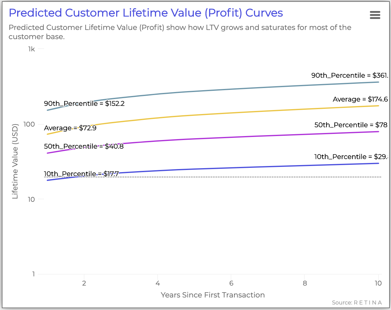
Next, we can look at the distribution of how each customer percentiles’ CLV matures over time. Ideally, you should see the curves grow over time.
Due to the low CAC, the company seems highly profitable–even for the lowest percentile of customers.
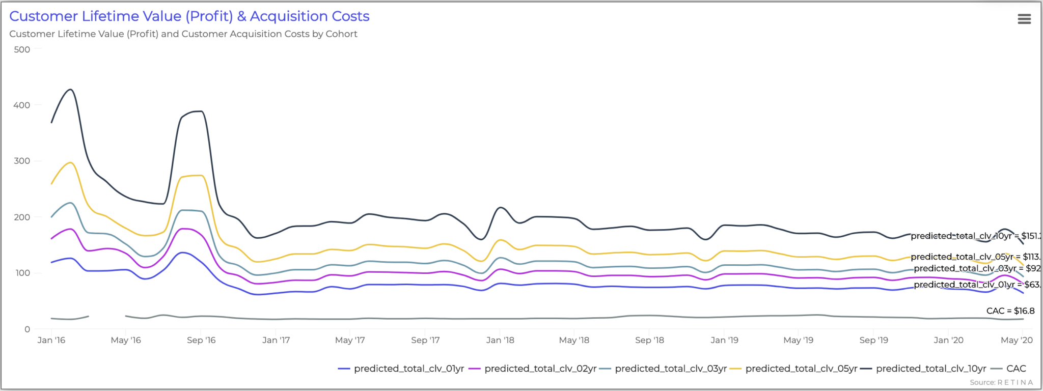
This chart shows Customer Lifetime Value (CLV) for each cohort and their CLV maturity time frame. If LTVs are improving, the curves will grow farther apart.
In this example, LTV is relatively stable over time.
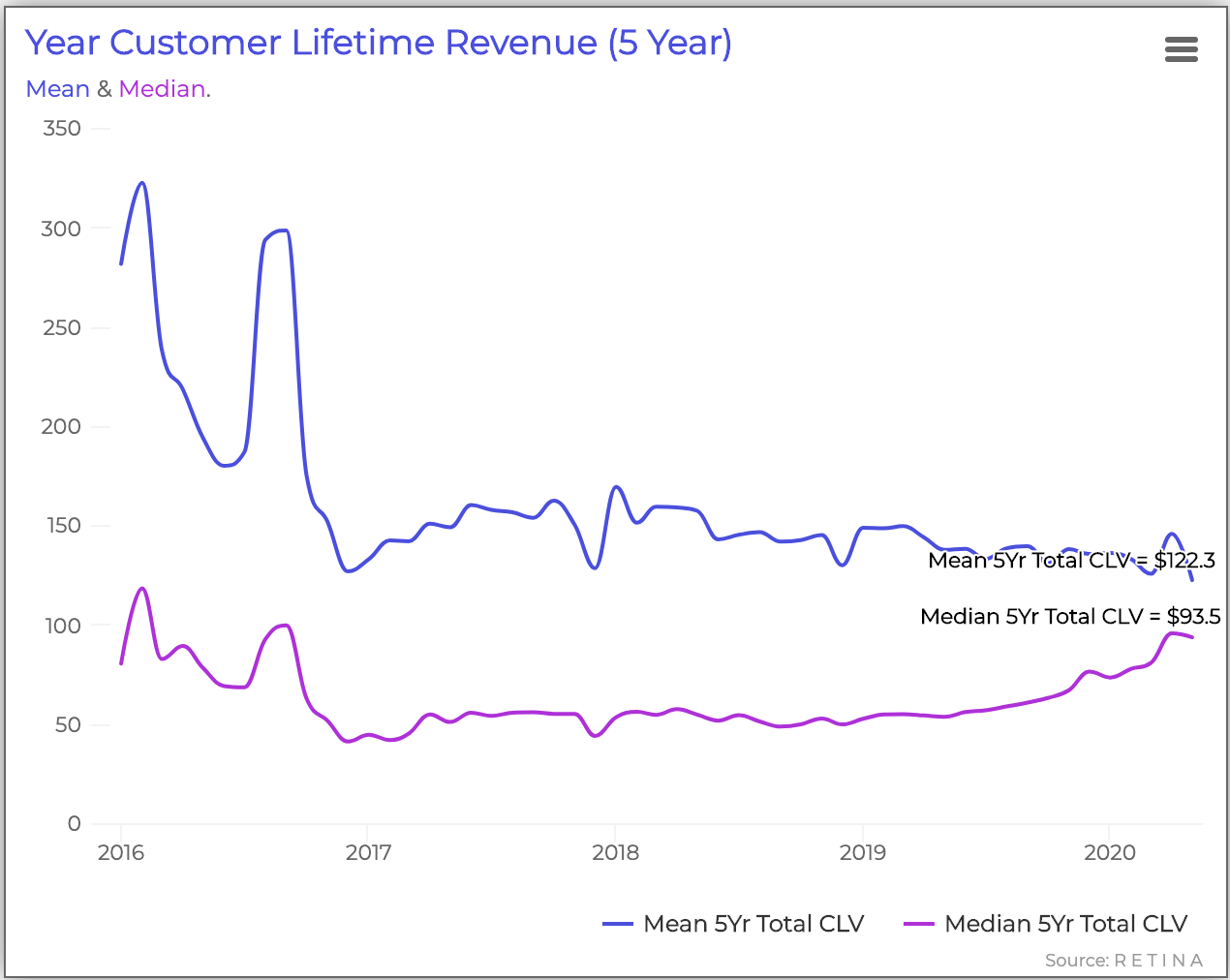
Finally, this chart shows the change in mean and median 5-year Customer Lifetime Revenue over time. The mean is represented by the top line (blue), and the median is represented by the bottom line (purple).
In this example, the mean and median LTR start to converge after 2016, meaning the company is building a more average customer base over time, removing outlier customers that spend the least and the most. This shift diversifies the company’s risk profile.
Customer Concentration
Similar to customer profitability, we can also use CLV visualization to showcase customer sales concentration.
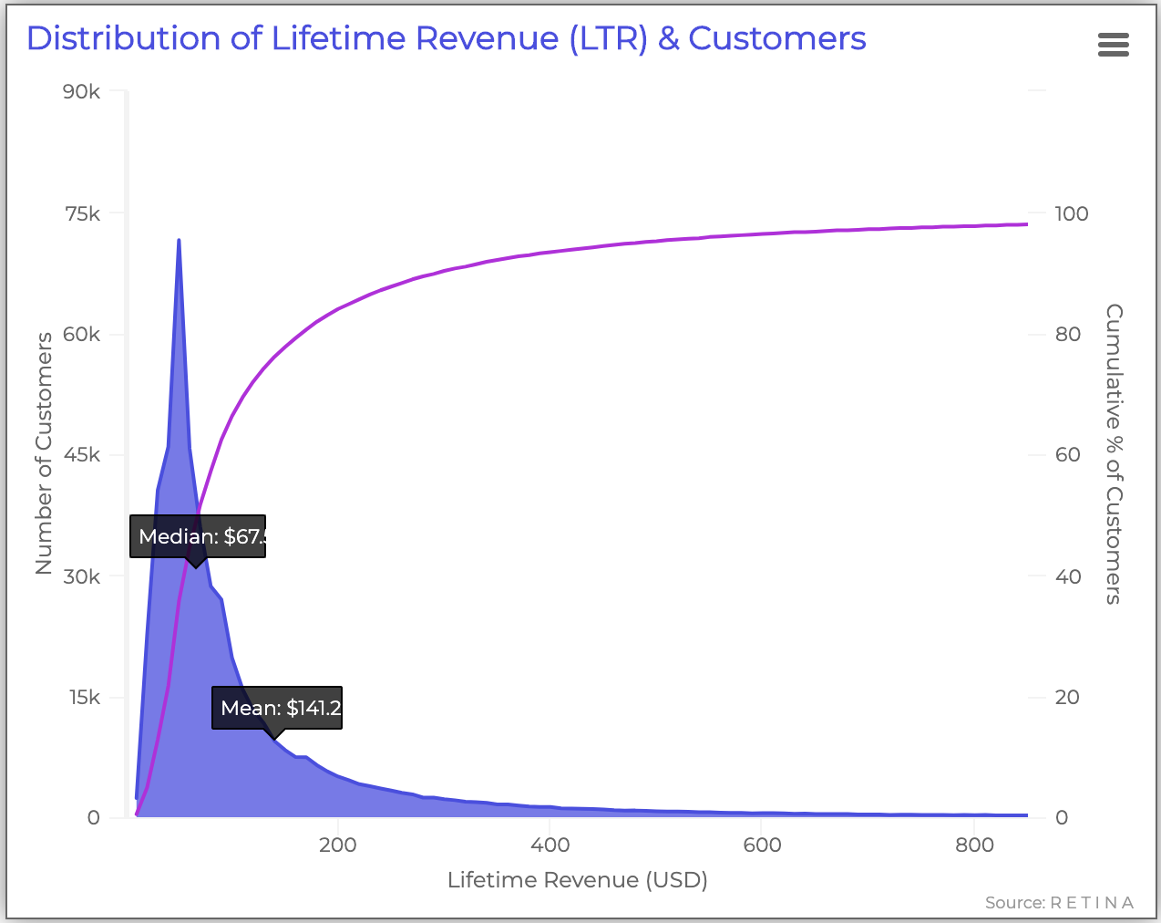
This chart compares the number of customers and their lifetime revenue to the percentage of customers by LTR. The purple line shows the cumulative percent of customers, whereas the shaded blue area shows the raw number of customers.
In this example, 90% of the customers have less than $200 LTR. Plus, there is a large gap between the median ($67) and mean LTR ($141). This indicates that loyal customers, or “whales” are pushing up the mean.
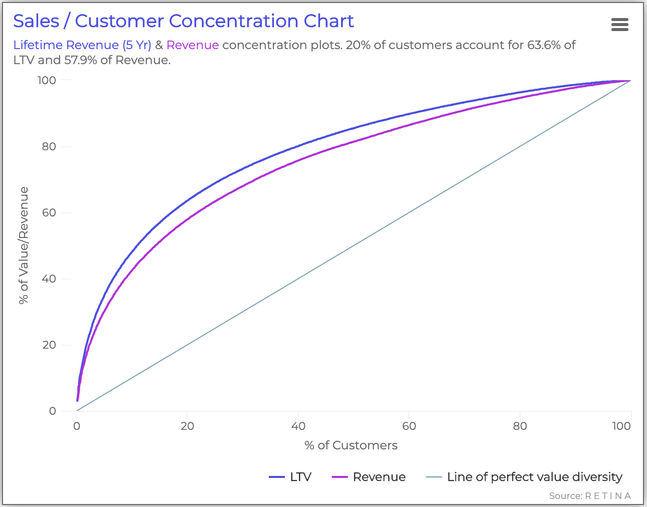
This chart reflects the value diversity of customers in terms of 5-year Lifetime Revenue and revenue. The light blue straight line represents perfect value diversity, the blue line represents customer LTR, and the purple line represents revenue.
This graph shows that x% of customers account for y% of LTV and z% of revenue. For example, 20% of customers account for approximately 63% of LTV and 58% of revenue.
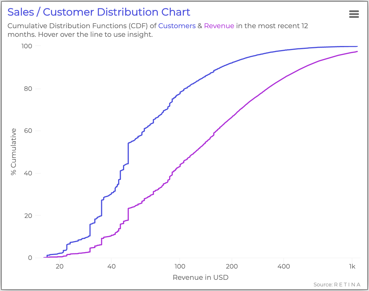
The next chart plots the cumulative distribution functions of customers (purple) and revenue (blue) over the past 12 months.
The vertical segments show that a significant group of customers purchased at certain revenue points. These insights can help the company adjust pricing strategies.
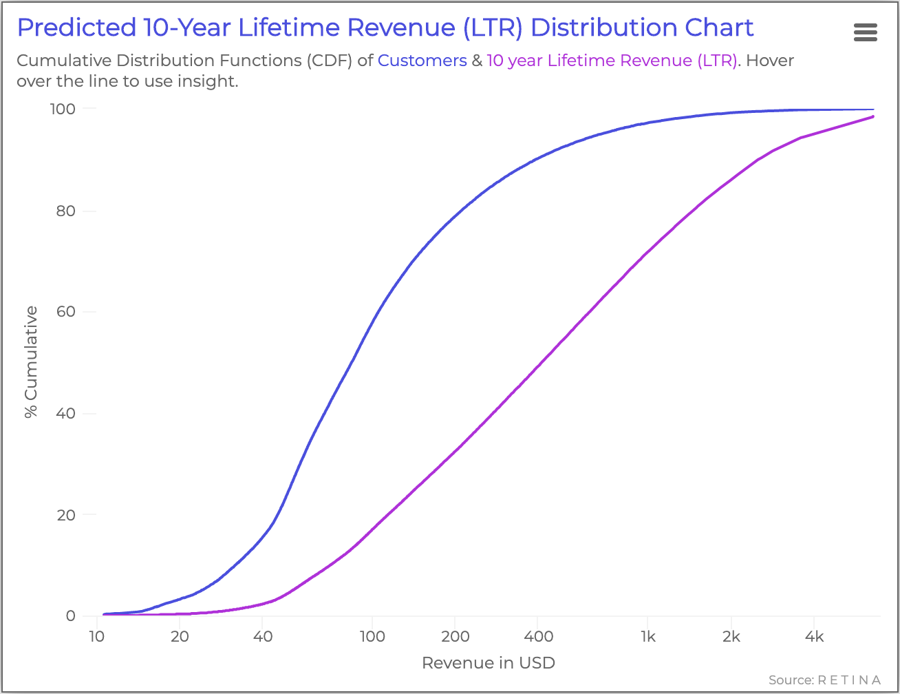
The last chart also shows cumulative distribution functions, but is normalized to account for recency bias. The purple line in this figure represents the 10-year customer lifetime revenue, and the blue line represents the percentage of customers.
——–
As displayed above, customer lifetime value visualizations can help you understand how the health of your customer base affects all areas of your business. We’ve shared simpler charts like customer spending by cohort and customer retention trends, and more complex visualizations like customer concentration and predicted revenue distribution.
For data scientists and business analysts, transforming novel and complex metrics into visuals can help you share results and predictions with great impact. It’s important for stakeholders to be able to visualize the importance of optimizing the businesses with CLV.