If you ever get the chance to talk to a VP of Analytics or a Head of Data Science, you will find that most have a very strong opinion on how to get the most out of data science work. Some loudly proclaim that data scientists “have their heads in the clouds” and care more about probabilities than products. Others (as the ones quoted below) claim it’s because not enough business people were involved in the process:
“Why do so many great data science projects fail to make an impact? Why do we keep making great stuff… and nobody uses it?” — Vice President of Analytics, Fortune 500 company
“The only way for data scientists to actually get stuff done is to throw an MBA into the mix.” – Data Science Manager, large media/entertainment company
All seem to agree that the problem, in their experience, reared its ugly head at some point. Personally, I have felt this pain firsthand. I, and data scientists the world over, have spent quality hours building out a tool or a dashboard for people to use, only for it to be forgotten and eventually deprecated a quarter later.
Eventually, after “launching” several products that were never used by their intended audience, I realized that the projects’ shortcomings stemmed from a flaw in our thinking. What we didn’t realize was this:
Delivering high quality data science work requires a high quality user experience.
Focusing on user experience as well as data science, I was able to create a data science product that was much better received than my previous underutilized iterations. This, in turn, led to more use and a bigger impact on the business — success!
Before I dive into the product itself, let’s flesh out what the bolded statement above means.
The Translation Problem
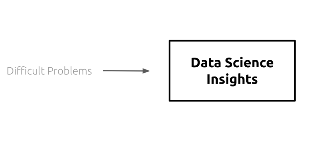
We often view data science as tackling challenging problems. Understanding the world and predicting the future are fundamentally difficult problems, and it is the task of the data scientist to transform these unwieldy problems into solvable statistics. Here is a simple visual to illustrate this point:
There are countless examples of this data science exercise, such as the one below:
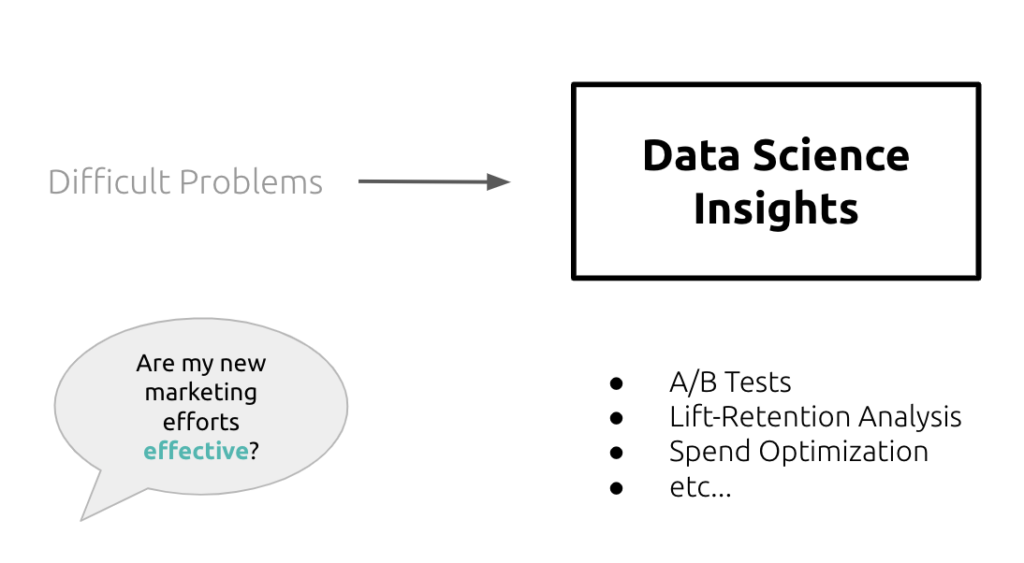
Understanding what “effective” means not only requires an understanding of the business context of the question, but also what tools are available to the data scientist, as well as the limitations of the data itself. This is a difficult task, and one that data scientists tackle day in and day out. Most would consider this the main objective of a data scientist’s role.
But there is a part missing from this equation; one that would actually finish the data science process — translating data science insights into business solutions:
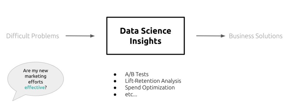
Without this translation, we are left with a “data science” answer to the original question:
- The p value for first purchase revenue between our split test populations is 0.04
- Engaged customers experienced an average CLV lift of 22%
- Etc…
If we were to present the above answers to the stakeholder who originally posed to us our difficult problem, their response would be a resounding:
“So what?”
This response doesn’t have to be explicitly spoken aloud to you — you can see it in the way the stakeholder interacts (or doesn’t) with your data science insights. If they can’t figure out how to apply this information to their workflows or how to take immediate action on this information, all of your analysis is going to have little to no impact.
It seems the data science impact was lost in translation.
Many of you reading this post will realize how strange it would be to simply parrot back the p-value of a split-test to a stakeholder; obviously, the disconnect between business and data science is more nuanced than that. Presenting a large amount of data-driven values in the form of a presentation or dashboard is oftentimes just as useless if the end user can’t move forward or change their behavior based on your insights.
This leads us to the importance of user experience and product in regards to data science. Just as a data scientist must acknowledge the business value of an analysis in order to create an actionable solution, he or she must also be acutely aware of the use cases a data science product addresses. Otherwise, that product won’t be used to its full potential.
A data product that …
- Can’t be used to take action immediately
- Has results that can’t be understood without effort
- Sits far outside the user’s typical workflow
… will always add more friction than it alleviates. The value these products provide is contingent on being used correctly and their ability to promote a more informed/streamlined user experience.
A real world example may help provide context to the above statement.
Building a Data Science Product
My company was asked by one of our clients to segment their customer base and build an interface so they could use this information. Segmentation is a difficult problem, but luckily, our data science team has experience in this area and was able to produce compelling results. The true difficulty, as this blog has alluded to, was the delivery of this information.
We could have built a dashboard.
The problem with a dashboard is nobody would use it. Dashboards add obstacles to a user, since they exist outside of a user’s current workflow. When they are out of a user’s workflow, dashboards force users to consciously change their behavior to find important information. Oftentimes, this is more of a hassle than it’s worth, and users end up not using our product. How can we solve this?
We put ourselves in the shoes of our end users — specifically, a customer service rep.

Our client’s workflow involved using phone calls to communicate with customers, using Slack to communicate with each other, and a CRM to manage tickets. Their pain point was that, when talking to a customer, they wanted important information about that customer on demand to decide what promotions to offer. In this scenario, especially, a dashboard would be a major inconvenience.
The business solution was to serve up customer information quickly within the rep’s already established workflow. That included information on how a customer’s segment impacts his or her customer service experience.
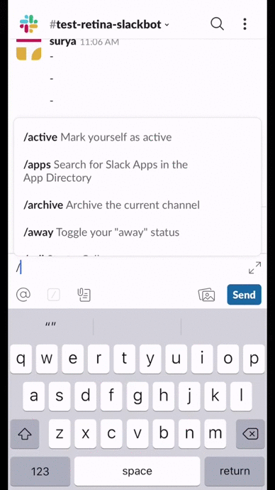
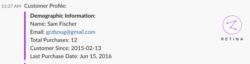
That’s why we built a Slackbot:
To quickly break down the pieces of this product:
- In addition to an individual’s assigned segment, the slackbot displays previous customer service tickets, customer demographic information, and previous purchase information. None of these are data science insights, but add context to the segment assignment and are immensely helpful to users.
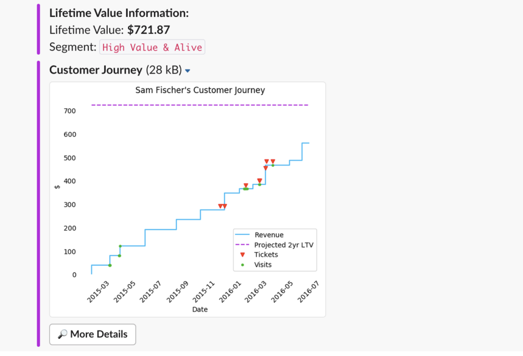
- The visual of a customer’s purchasing history (or customer journey) is a visual representation of all that information, allowing the rep to quickly process of this information.
- The difference between the predicted CLV (purple line) and the total revenue (blue line) helps express not only the segment assignment (high value and alive) but also information on how much of an appeasement package the customer service rep can use
- The fact that this information is in Slack, rather than a third-party dashboard, encourages customer service reps to use it more frequently.
Next Steps
I used this example specifically because it didn’t require an engineering team to accomplish; it was actually prototyped by the data science team itself.
Hopefully this framework will help other data teams remember that while statistics and modeling constitute 80% of their work, the remaining 20% dedicated to design and product considerations are just as crucial to the success of their project.
Keeping users and their friction points at the forefront of our minds as data scientists is key to ensuring our hard work is used to its highest potential.
Retina
At Retina, we believe every business deserves to have the best relationship possible with its customers, not just the behemoths like Amazon and their army of data scientists. Thats why we work to create data science projects with great user experience, like the above.
One of our free products, Retina Go!, leverages our cutting-edge customer lifetime value models in an easy-to-use form