When assessing the health of a business, we look at a variety of numerical factors: financial ratios, growth trends, cash flow projections, etc. However, when assessing the health of a company’s customers, it’s common to struggle with quantifying the concept of product-market fit. One way to track the quality of customers is to look at the distribution of product-market fit in the form of a cumulative revenue concentration graph. This is also known as the Sales Gini Index.
How to read this chart:
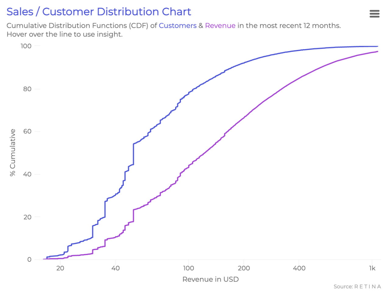
- This chart shows the distribution of cumulative customers and cumulative revenue (y axis) generated by customers at different historical revenue thresholds (x axis).
- The Revenue line is a direct function of the Customers line
- We can read any point as: X% of customers generated at least $Y in revenue (or Z% of revenue was generated by customers who have at least $Y in revenue)
To form an intuition regarding the shape, let’s first look at the Customers line. The slope represents the rate at which the number of customers increases as we increase the revenue threshold. This means relatively flat (horizontal) areas are “outliers”, or “less dense”, as fewer customers fall in that revenue range. Steeper areas are “more dense”: many customers fall in that revenue range. If we were to convert the cumulative distribution to a probability distribution, the steepest areas would be close to the peak of the bell curve.
The above chart portrays the customers of Groomers, a men’s care ecommerce business. In the Customers line there is a steep jump at around $6, suggesting that a large percentage of these customers are one-and-dones. There is also a long, flat area near the high end of revenue representing the presence of whale customers (high-spending outliers). Although there is a wide range of purchasing behavior in Groomers’ customer base, the typical customer has spent around $50.
While the customers line helps us get a sense for the overall distribution, we look to the Revenue line to visualize the customers’ impact on the business. The longer the flat section to the right of the curve, the less the business depends on whales. In this example, Groomers has some dependency on whales. Roughly 10% of their revenue came from the small fraction of customers who spent 10x more in total than the typical customer. This can be dangerous; Groomers might lose a disproportionate chunk of earnings if they somehow lose this handful of high-spending customers. This is especially apparent when we consider the Customer Lifetime Value version of the sales concentration graph.
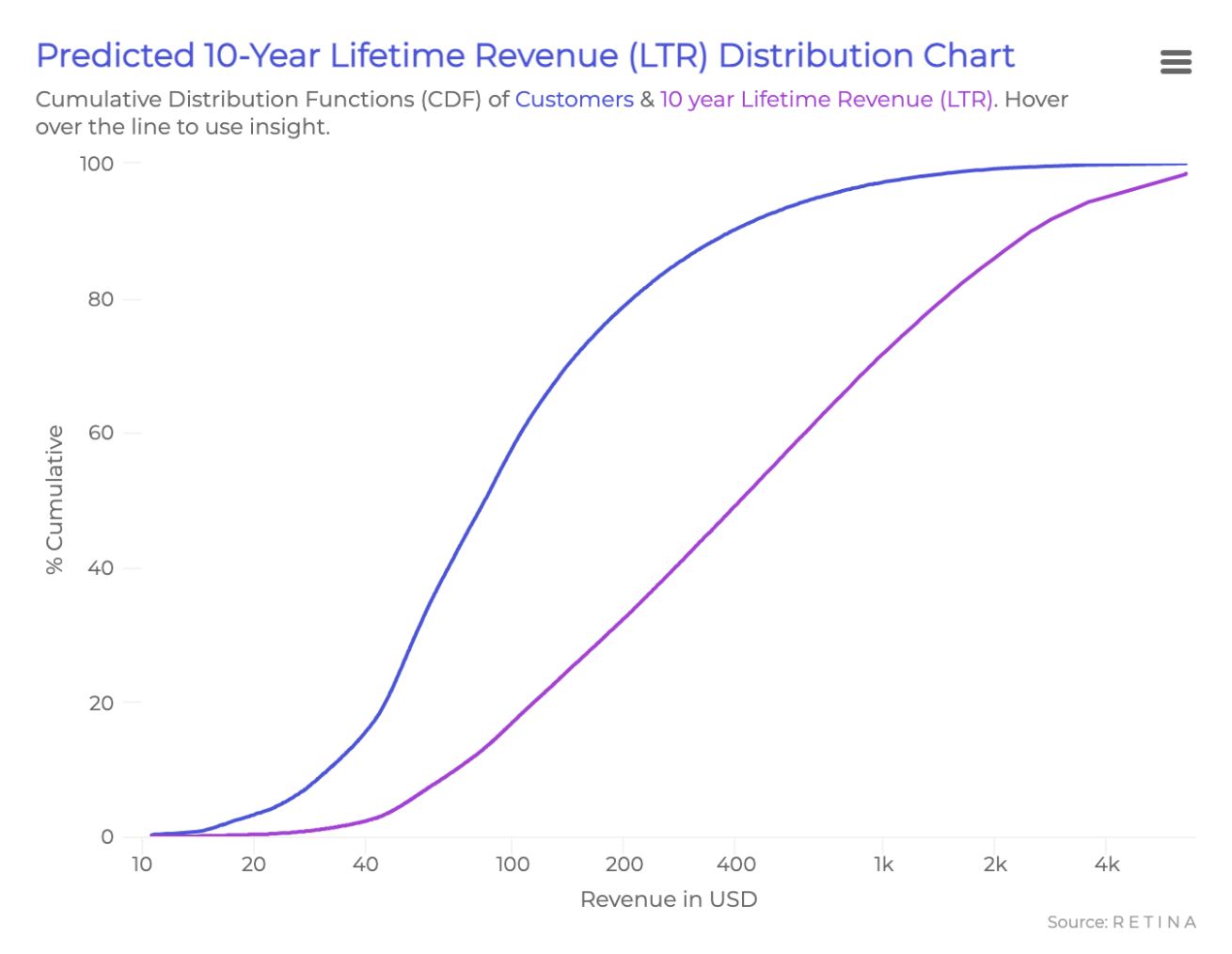
Note: We prefer the predicted 10-year LTR version of the concentration graph since it normalizes for recency bias. A growing business will have many new customers who haven’t gotten a chance to purchase that much yet and may inflate the low value customer counts.
This graph follows the same concepts as the one above, but instead of historical revenue we will analyze predicted 10-year lifetime revenue (the amount each individual customer is predicted to spend in their first 10 years). For Groomers, 10% of the predicted lifetime revenue will come from the top 0.5% of customers. This is alarming because, compared to before, we’re now including future revenue instead of just looking at past big spenders. If Groomers loses just this top 0.5% of customers, they will lose close to 10% of projected future earnings.
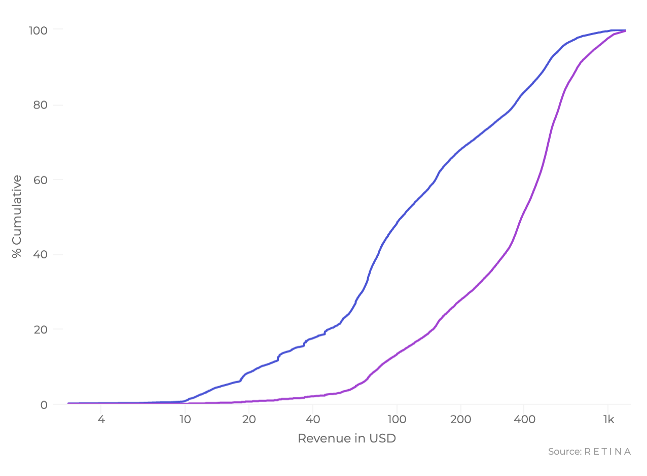
Understanding this tidbit about CLV concentration is a start, but how can we correct this? One way is to predict and use customer-level CLV to acquire new leads who look like the top customers. By doing this, we can reduce the vertical difference between curves in the graph’s right hand side and therefore reduce reliance on the whales. For example, the graph below is for a different business with a healthy CLV concentration. The top 0.5% of customers are only worth 2.5% of the total predicted CLV.
With understanding of the product and knowledge of the industry, we can obtain further insights from these charts. Groomers has an average order value of $60; this means the top 20% of customers (who are predicted to spend $180 or more in their first 10 years) will buy at least three separate times, and the average customer usually buys just once or twice. With this context, we know that if we can figure out how to encourage repeat purchase behavior we can greatly increase the overall value of our business.
It’s also important to keep in mind the industry when looking at this chart. Subscription businesses are much less reliant on whales in general but can still benefit greatly from CLV-based marketing optimization. For B2B SaaS businesses, high CLV concentration in a minority of customers can suggest the company is becoming a consultancy instead of a product-focused company. Check out our white paper on this concept for a deeper dive.
Our Quality of Customers report contains a bundle of insights in addition to CLV concentration, such as pinpointing unprofitable customers. Read more about visualizing CLV or contact us for more information.